Todua Clinic
Website for a clinic
About company
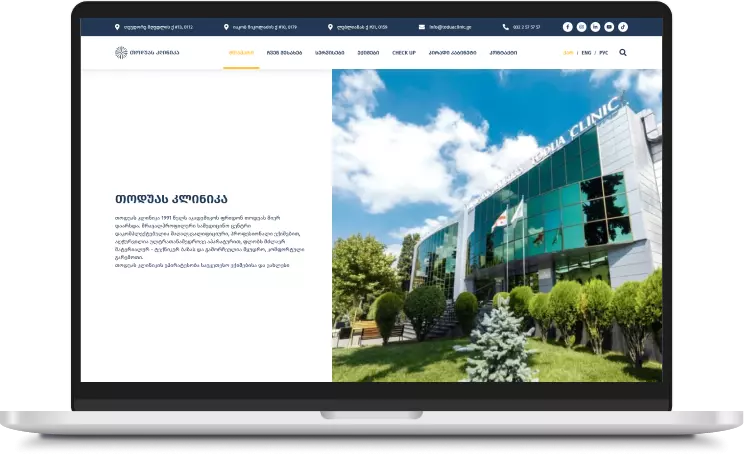
The client, a clinic based in Georgia, approached us for a site redesign and enhancement to better showcase their services and attract both local and international patients. They needed an updated, user-friendly interface that aligned with their branding and provided a more seamless experience for visitors. Our task was to refine the existing website, ensuring that it effectively communicated the clinic’s expertise while improving functionality and aesthetic appeal.
Aims and Objectives
The site’s outdated design was not effectively representing the clinic’s professionalism and expertise.
Navigation issues made it difficult for users to find information about services and treatments.
The website lacked optimization for attracting international patients.
Solutions
01.
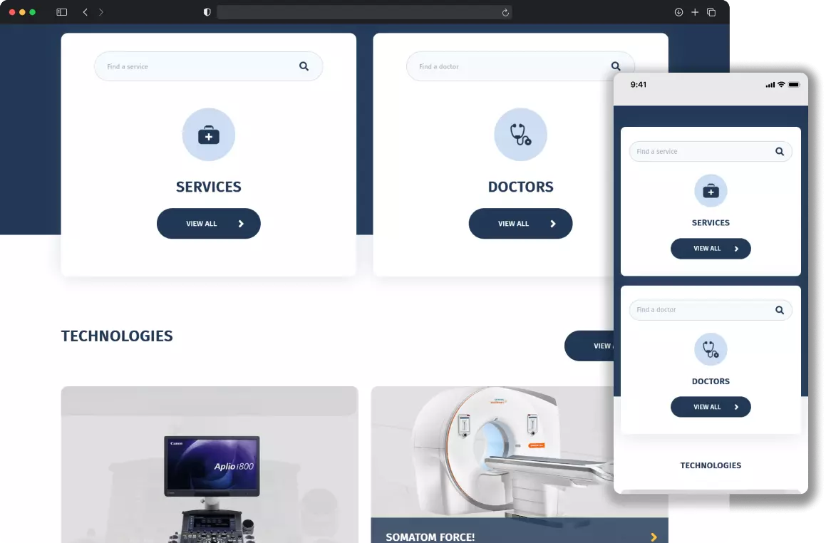
To modernize the design, we created a fresh, professional look that aligns with the clinic’s brand identity, using clean layouts and high-quality visuals to convey trust and expertise. We also implemented a cohesive color scheme and typography to enhance visual appeal and consistency across the site. This updated design now better represents the clinic's standards and builds credibility with potential clients.

02.
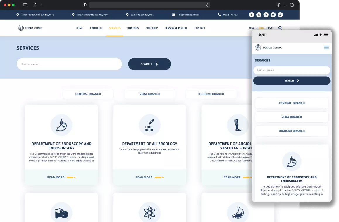
To improve navigation, we reorganized the site structure, making key information about services and treatments easily accessible from the homepage. We added a clear menu and strategically placed call-to-action buttons, guiding users to relevant sections with minimal effort. These changes provide a smoother user experience and help visitors find what they need quickly.

03.
For attracting international patients, we optimized the site for multilingual content and implemented targeted SEO strategies, focusing on keywords relevant to medical tourism. Additionally, we added a dedicated section for international patients, including details on travel assistance and accommodations. This approach helps the clinic connect with a global audience and facilitates a welcoming experience for foreign patients.


04.


